Modern NGO Website Design
Isn’t it interesting and sometimes strange how different sectors develop their own look and feel? Certain logos just ‘feel’ like they fit tech companies, certain colour palettes seem to fit design-related products. Financial institutions tend toward blues, while fitness companies tend to favour oranges, reds and heavy fonts. And we start to get used to a specific style associated with non-profit, charity or NGO websites too. In the past five years I would have expected to see bold use of black and white with splashes of yellow, stock photos desaturated with a colour wash over them, lots of round icons noting how many houses have been built, or families supported, or girls’ education sponsored. But recently I’ve noticed that the traditionally conservative approach to NGO website design is being challenged by a more modern look that incorporates the use of retro fonts, unconventional colourways and fresh illustration.
Have a look at some of these inspiring examples below to rethink what your NGO website could look like.

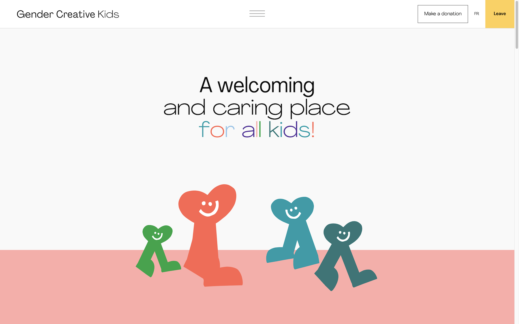
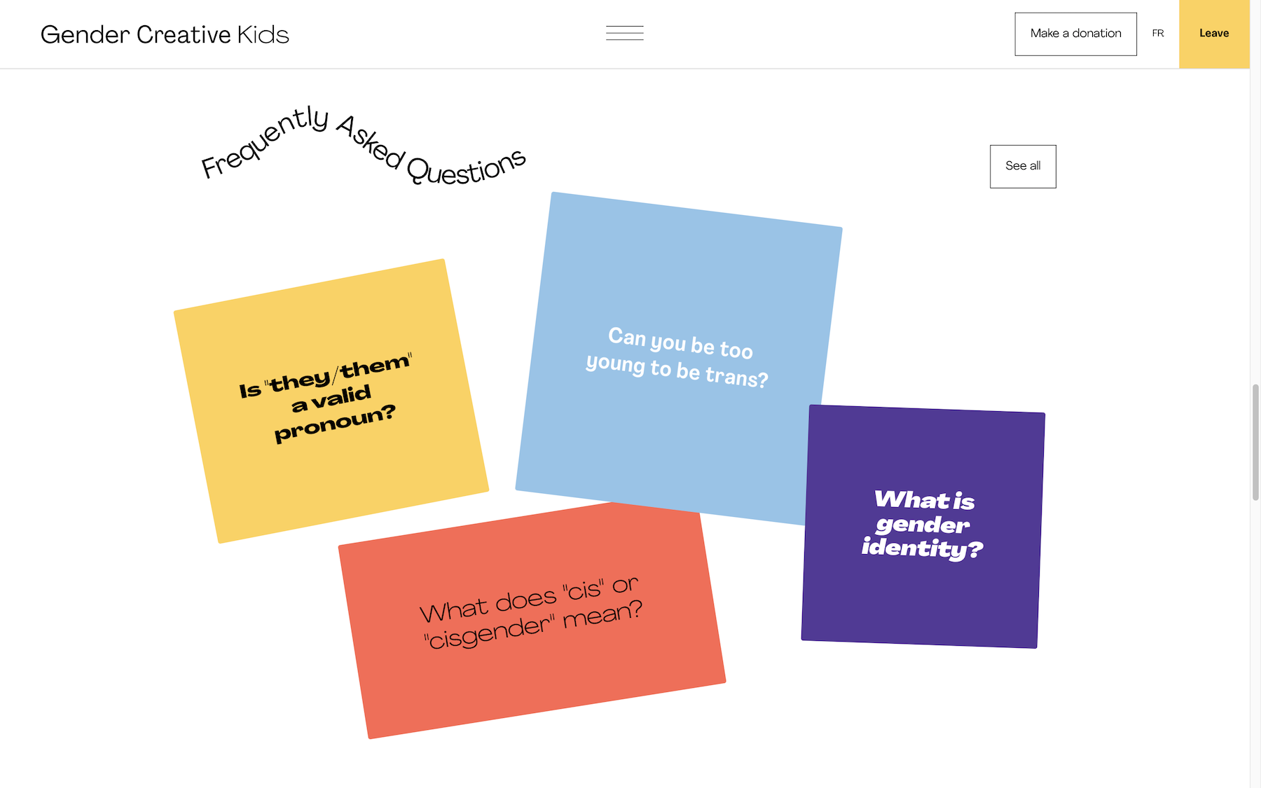
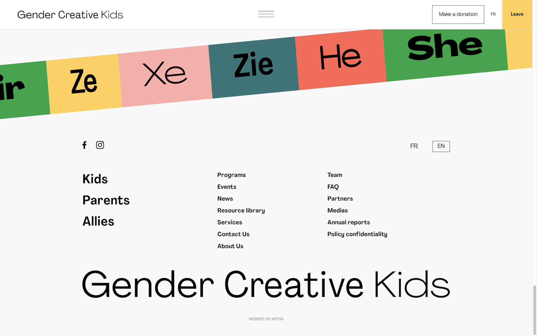
01 | Gender Creative Kids
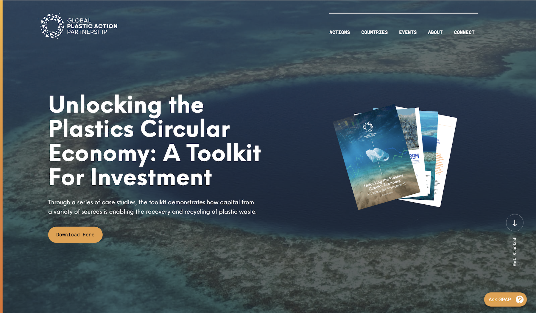
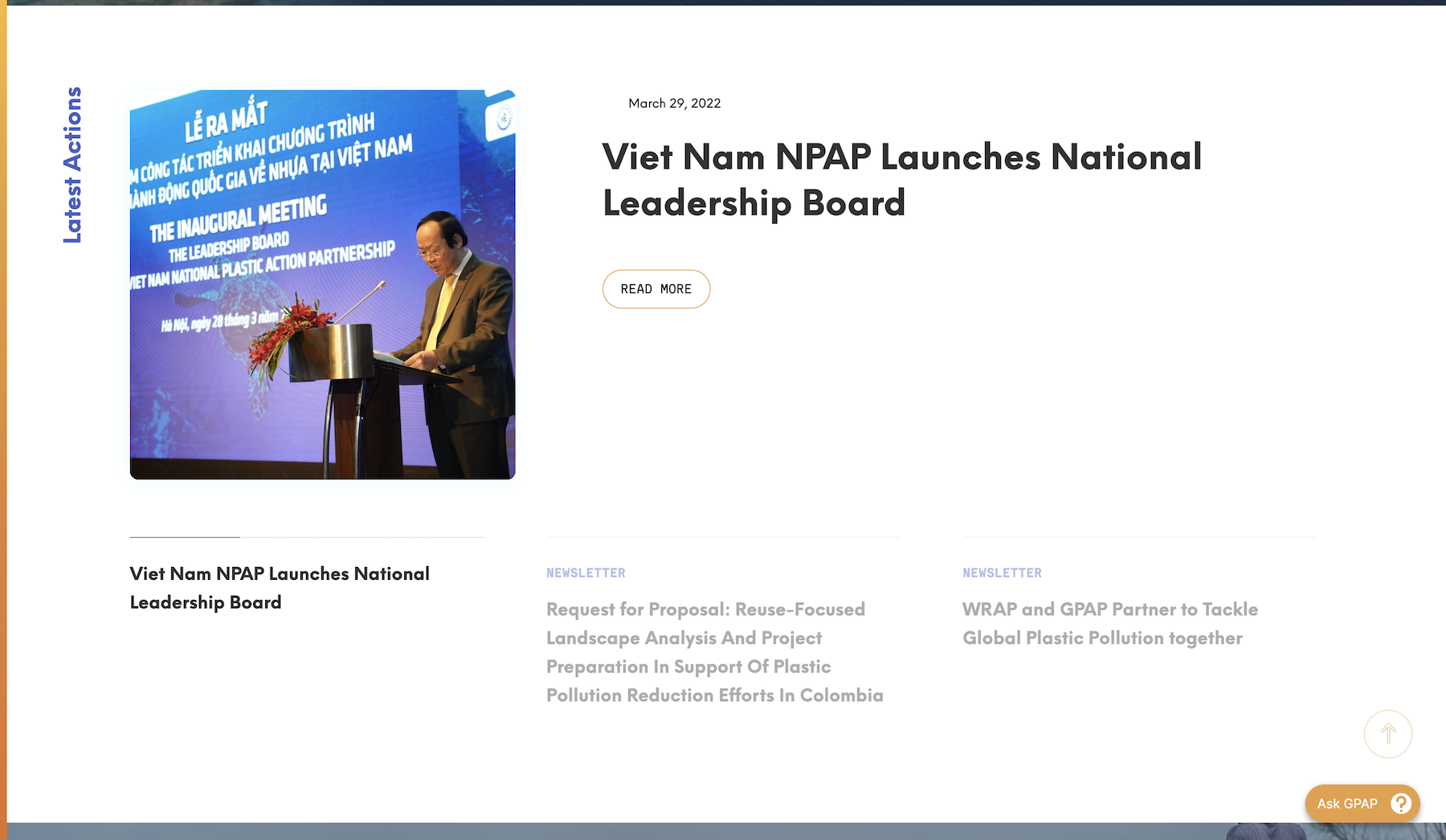
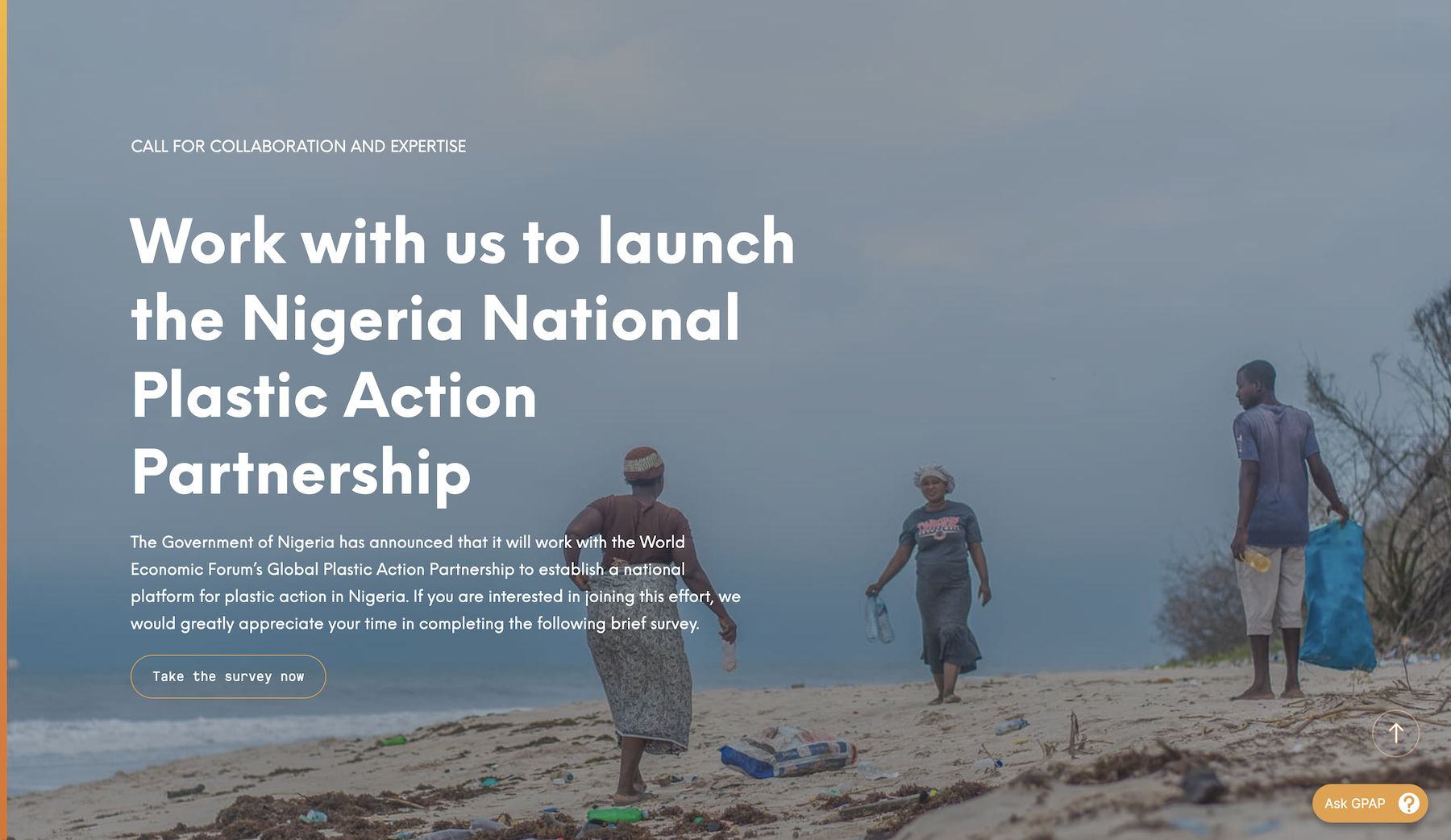
02 | Global Plastic Action Partnership
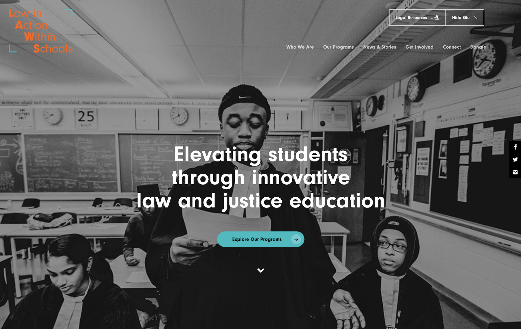
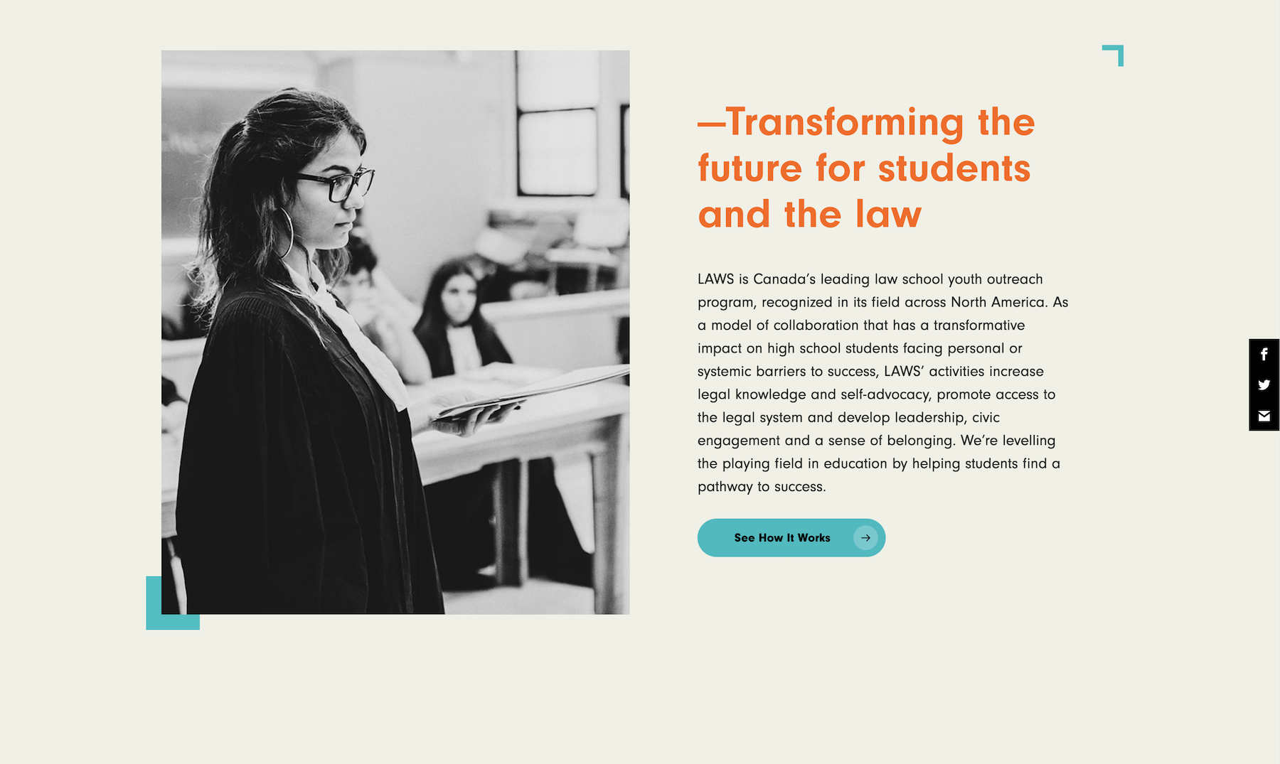
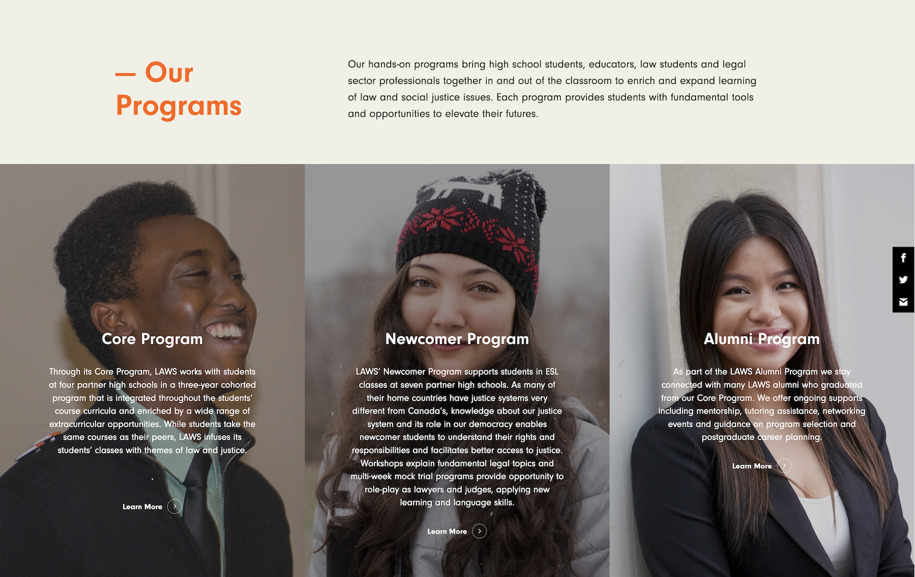
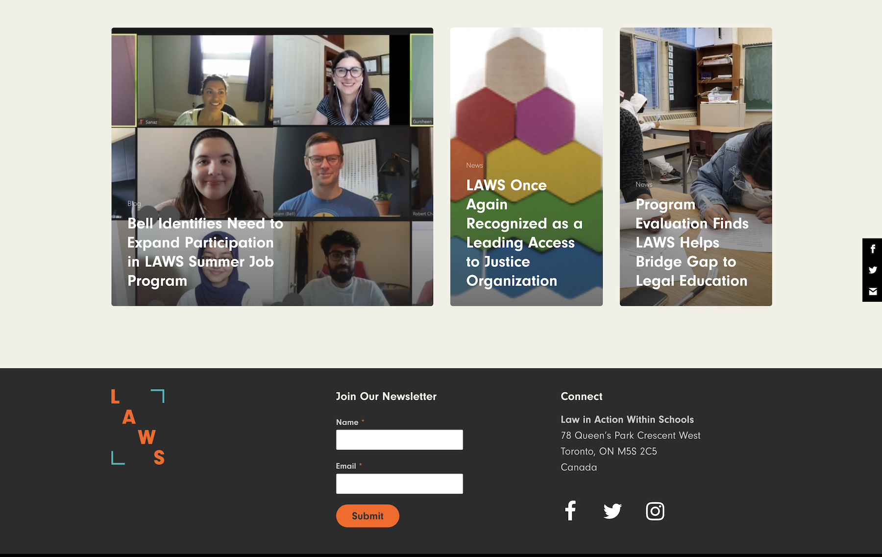
03 | Law Action Within Schools


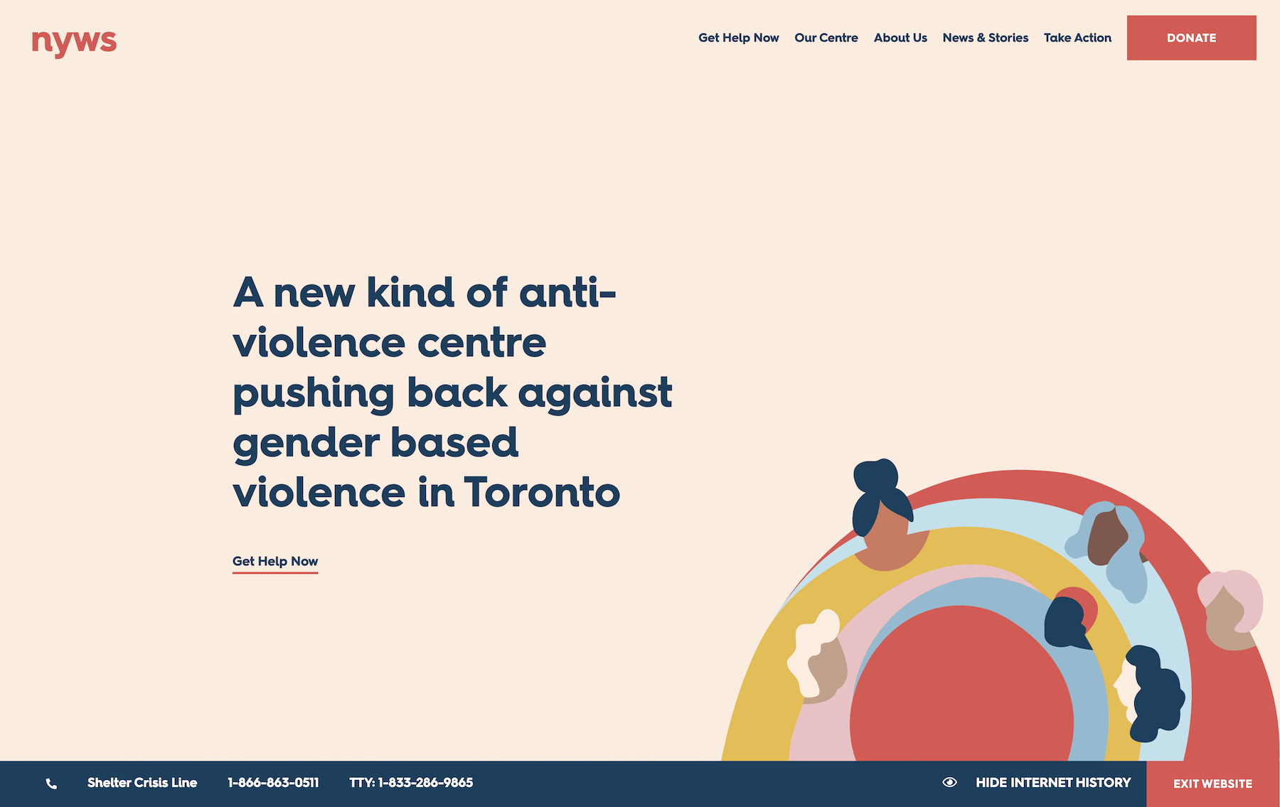
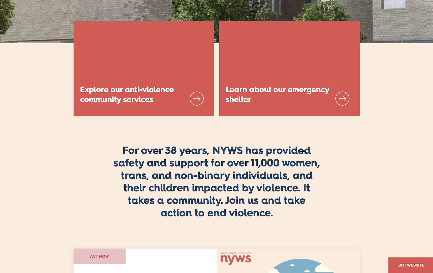
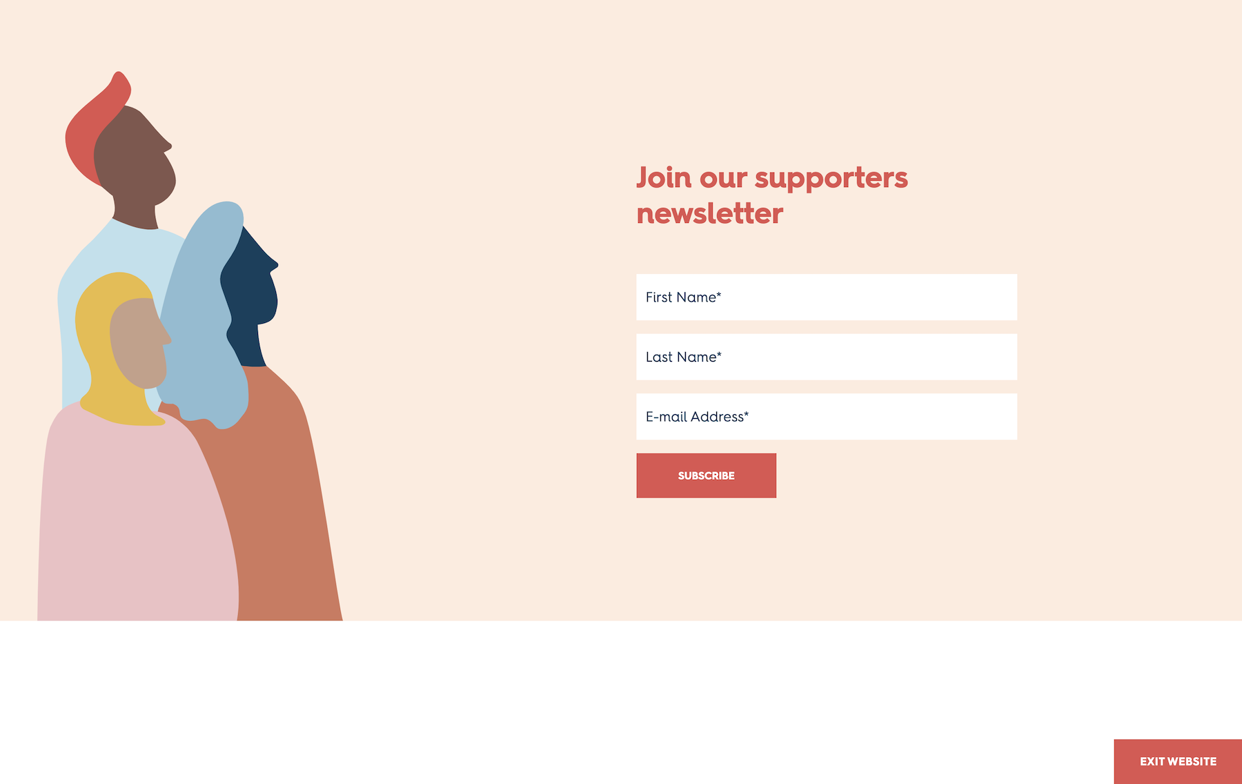
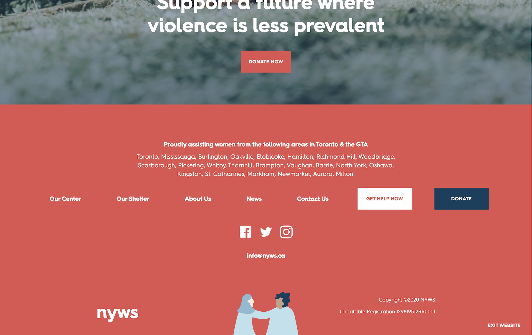
04 | New York Women’s Shelter
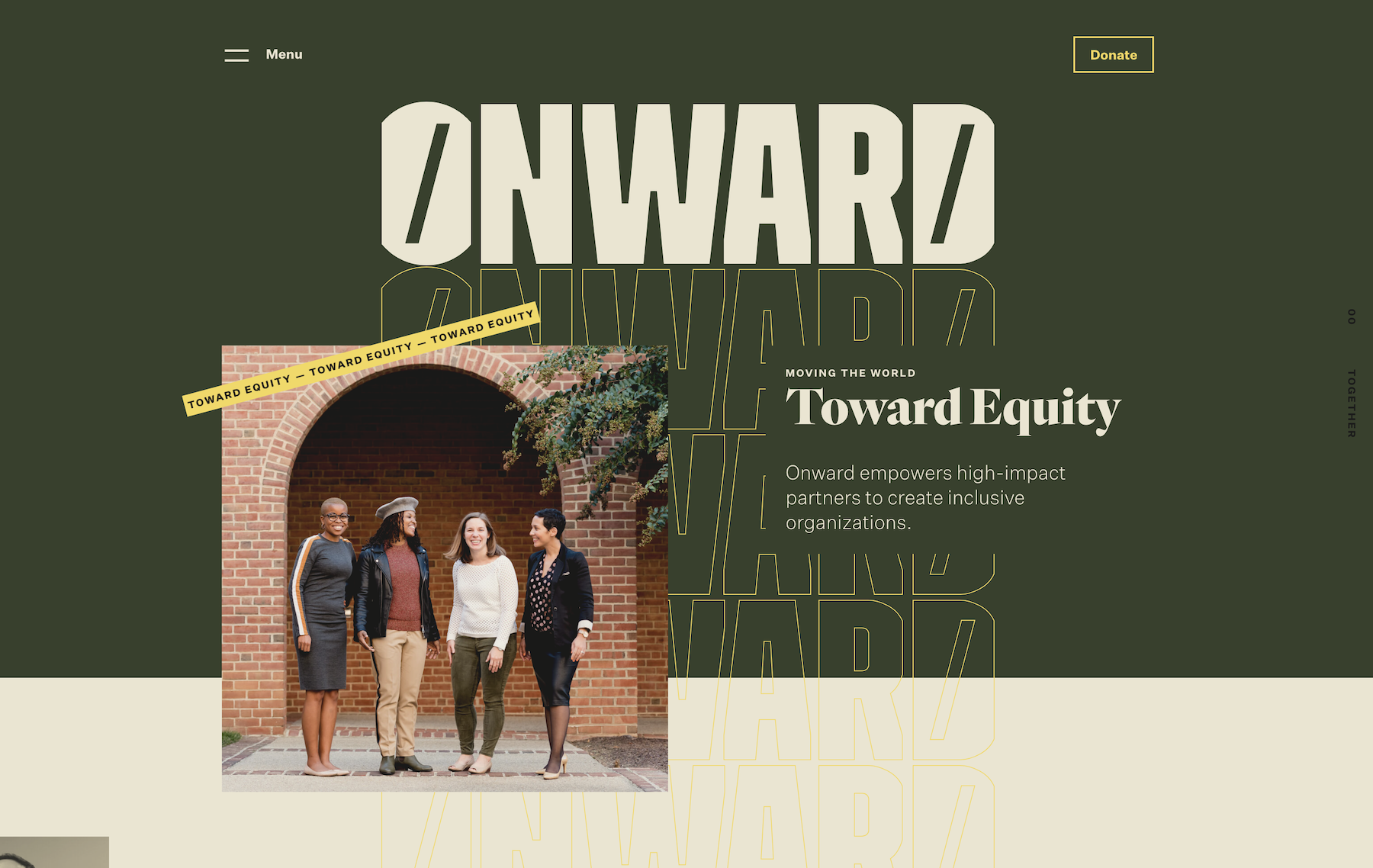
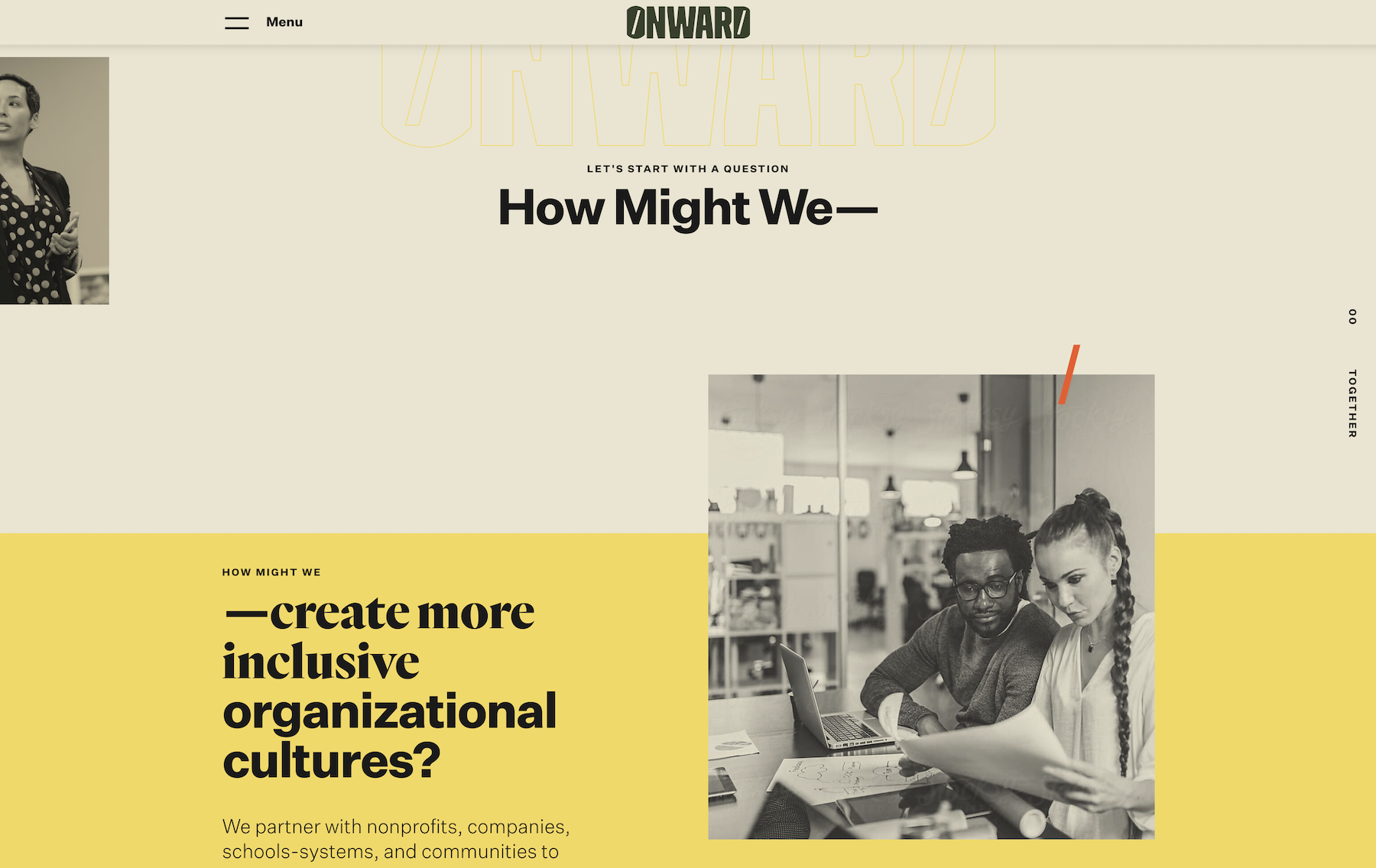
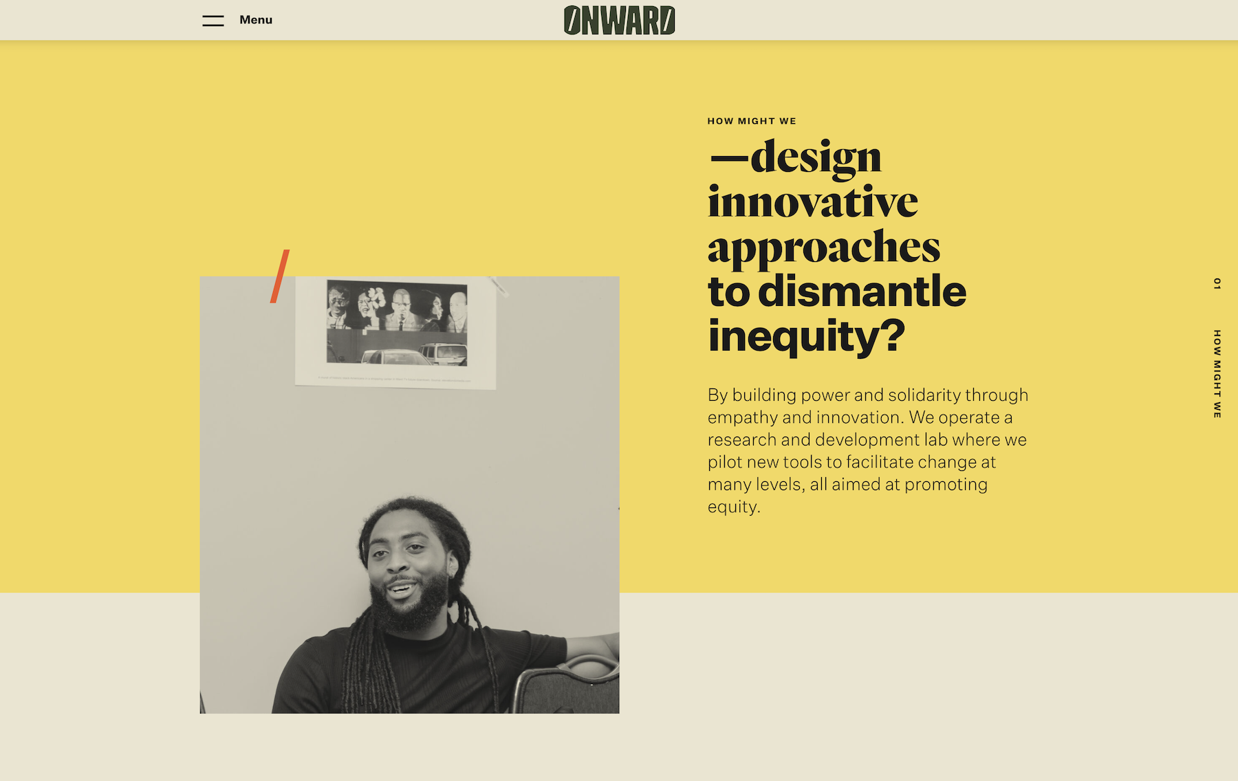
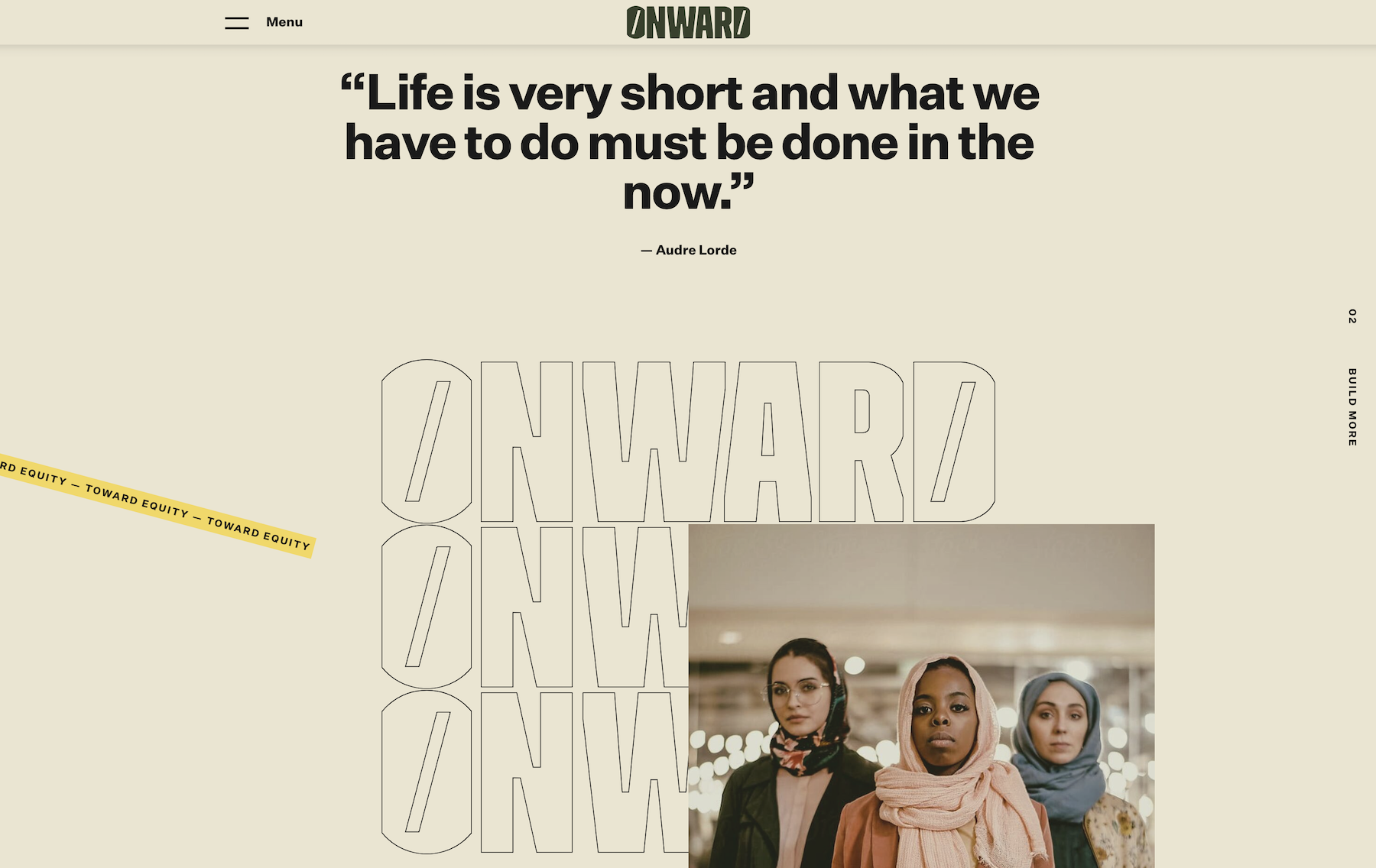
05 | Onward
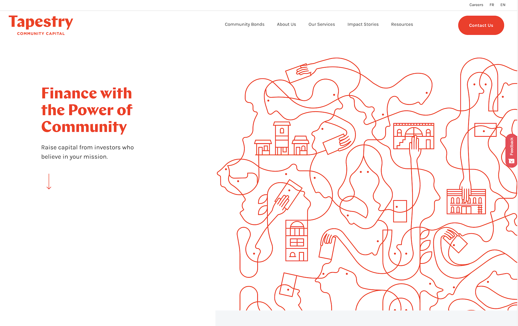
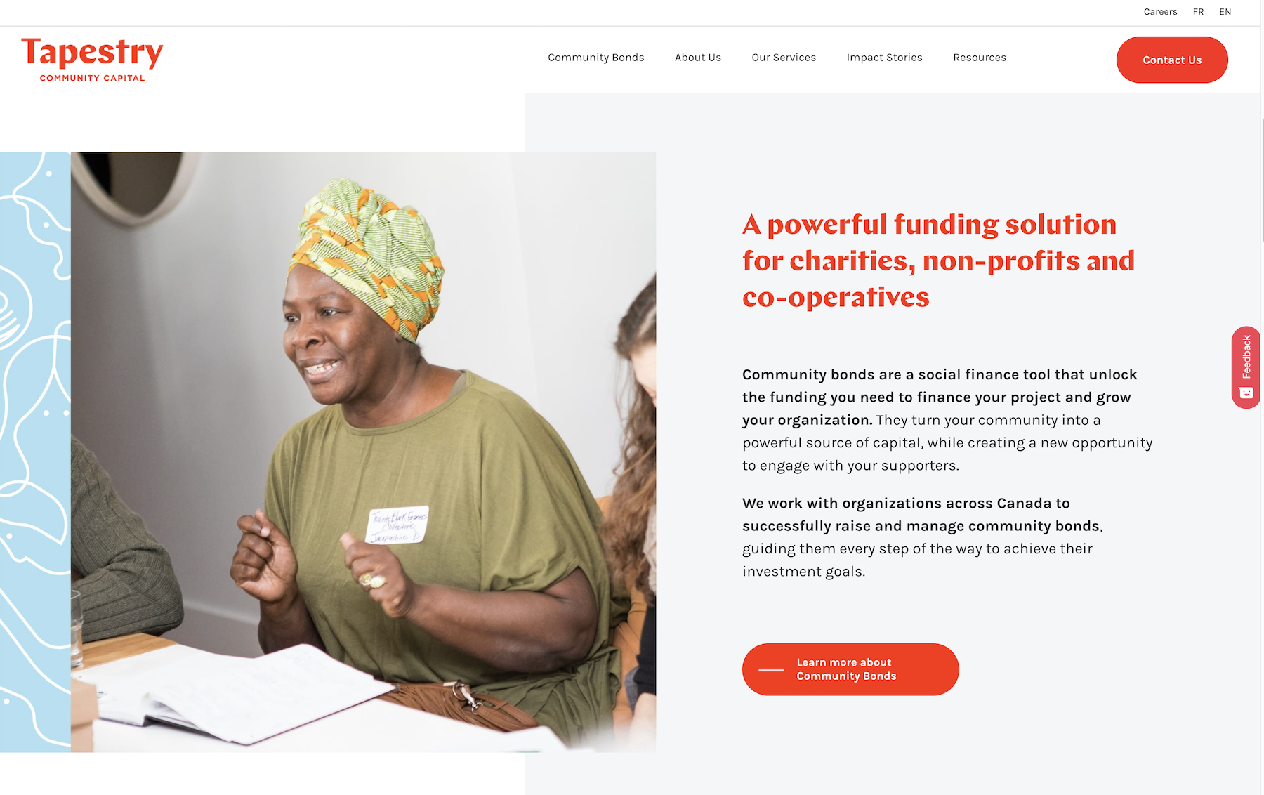
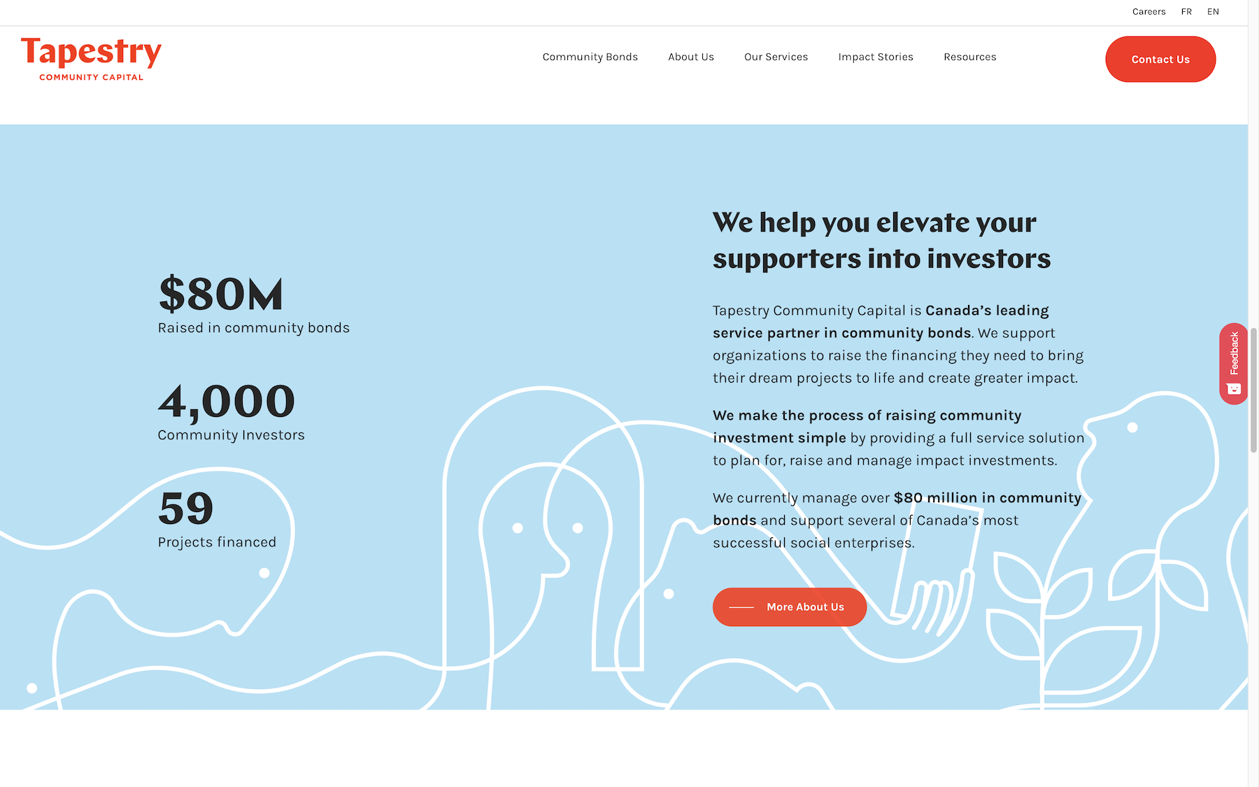
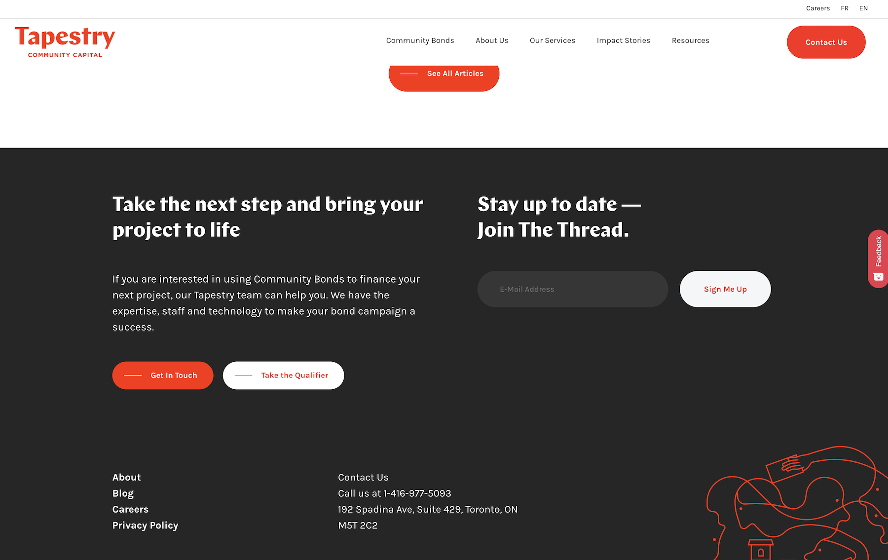
06 | Tapestry Capital